Hello, I’m Aretha. I’m a UX/UI designer and digital marketer with a background in fashion design, where I first learned that great design always comes back to how it makes people feel. That foundation shaped the way I approach every project, with empathy, intention, and an eye for detail. Welcome to my portfolio!
Web & App Designs
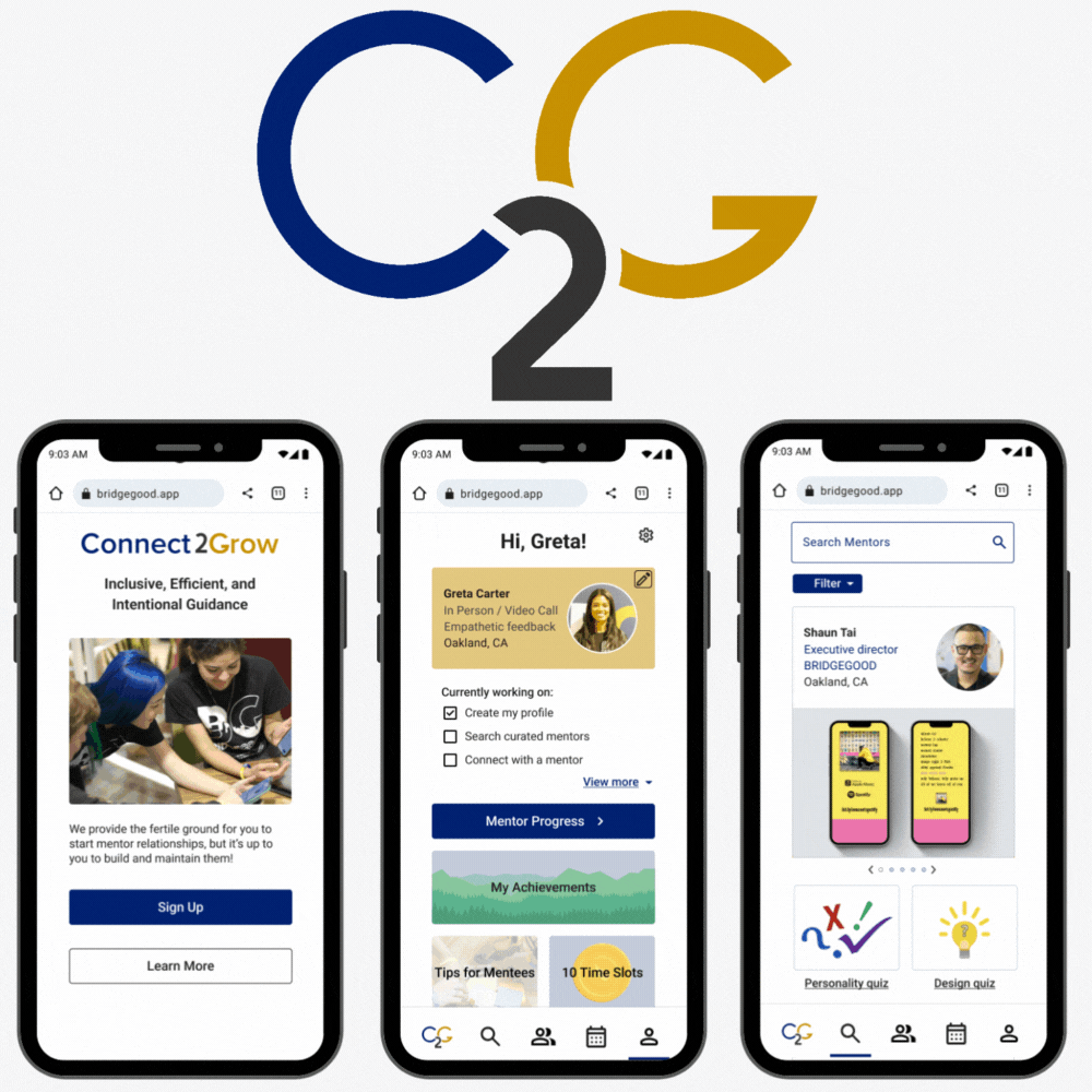
Connect2Grow
Guided Growth Through Mentorship
In a fast-paced three-week design sprint, our team partnered with BRIDGEGOOD, a non-profit organization, to ideate and build an app centered around real user needs. Close collaboration with their Executive Director and Program Manager kept our work grounded in their mission from start to finish, advancing their core purpose of making design equity a reality for all.
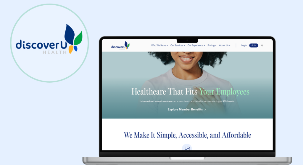
DiscoverU Health is a modern concierge care digital service offeringintegrative, preventative care through affordable and transparent plans for individuals, families, and businesses.
My journey with this startup began as a Graphic Design Intern, where I built a thorough understanding of the brand’s identity, voice, and user pain points. When I transitioned to the UX team, that insider knowledge became a bridge between data, stakeholder insights, and design decisions, helping the team deliver a final website experience that communicated the core service clearly, intuitively, and with the user always at the center.
Maria Kotze Gardens
Capturing two decades of creative expertise and a personality as vibrant as the landscapes she designs is no small task. This website revamp for award-winning landscape artist and technologist Maria Kotze was built to do exactly that, balancing warmth and professionalism to create an intuitive journey that resonates with both her audience and her clients.
Custom Digital Billboards created for San Jose City College’s Marketing Department
Software: Adobe AfterEffects, Illustrator and Photoshop
Logo Design
Perceptum – Old Logo
Perceptum New Logo With Tagline
Perceptum New Logo
Perceptum Logo Monochrome
DUONEXA Logo
Perceptum – Logo Redesign
Perceptum is a business coaching company built around one idea: people are the asset. The redesign translates that into a logo that speaks to organizations investing in human potential over process. The original mark was chaotic: competing typefaces, a dense wireframe sphere, motion with no clear direction. The rebrand centers on a single form: a nautilus spiral in a gradient moving from deep teal through amber to gold. The new tagline, “Humans in Growth Motion,” earns the shape. A spiral is growth by definition. The logo holds in full color and monochrome without losing its structure.
DUONEXA – Logo Design Two counter-rotating arcs form a single continuous motion. The mark is built on the name: duo, two forces, one system. The teal linework on black keeps it precise without being cold. No gradients, no texture, nothing decorative. The geometry does all the work.