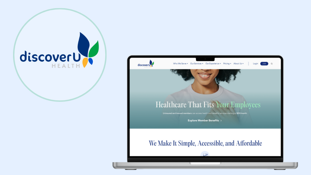
DiscoverU Health is a modern concierge caredigital service offering integrative preventative care through affordable, transparent customizable plans for individuals, families, employers, small businesses.
ROLE
UX Research, UI Design, Team Facilitator
SKILLS
User Research, Wireframing, Visual Design, Branding, Prototyping, Team Management and Communication
DiscoverU’s healthcare services were divided between two separate websites—DiscoverU Cares (65+) and DiscoverU Health (under 65). Resulting in a fragmented and confusing user experience. Users were forced to switch between platforms to find relevant information, encountering inconsistent branding, mismatched design patterns, and an unclear overall value proposition.
The signup process further compounded these issues. It lacked proper input validation, relied on complex medical terminology, and required users to navigate back and forth between pages to compare plans and complete enrollment. This created friction, increased the likelihood of errors, and diminished user confidence at a critical decision-making stage.
Solution
We unified both websites into a single, cohesive DiscoverU platform supported by a consistent design system and streamlined navigation architecture. This consolidation clarified the brand, simplified content discovery, and established a seamless cross-age experience.
To improve enrollment, we introduced a clear information hierarchy, replaced complex medical jargon with plain-language explanations, and implemented real-time validation with inline error prevention. The redesigned signup flow featured persistent plan comparison tools and contextual guidance, eliminating unnecessary back-and-forth navigation.
Target Audience
Individuals, families, employers, small businesses, freelancers and entrepreneurs between the age’s of 18 – 65 year’s old.
Research
To better understand the digital healthcare landscape and identify opportunities for differentiation, we conducted an in-depth competitive analysis of Included Health, One Medical, and Vitable Health.
Our evaluation focused on both strategic positioning and user experience execution across the following areas:
Value proposition clarity and differentiation
Membership model (flow, tiers, and enrollment experience)
Target audience segments
Pricing structure and transparency
Coverage plans and service offerings
UX strengths and weaknesses/friction points
App/store ratings and user sentiment
User demographics and acquisition channels
Website traffic patterns and platform infrastructure
Social media presence and brand voice
Operational and financial metrics
This allowed us to assess not only what each competitor offers, but how effectively they communicate, deliver, and scale their value through digital touchpoints.
Heuristic Evaluation
Using established usability principles, we evaluated each platform’s:
Information architecture and navigation clarity
Transparency of pricing and coverage details
Onboarding flow efficiency
Consistency in visual hierarchy and messaging
Trust-building elements (reviews, credentials, FAQs)
Accessibility and mobile responsiveness
This evaluation surfaced usability gaps, cognitive overload points, and missed opportunities for clearer user guidance and experience, particularly in explaining complex healthcare benefits in simple, actionable language.
Key Findings
Value communication varies significantly.Some competitors clearly articulate outcomes and benefits, while others rely heavily on feature lists without connecting features to outcomes.
Trust and transparency directly influence user decision-making. Clear coverage details, provider access, and total cost information are essential to building confidence.
UX refinement differs across platforms.Some competitors demonstrate strong visual design and structured onboarding, others lack hierarchy and guided information flow.
Value Propostion
We want to simplify access to affordable healthcare by making eligibility, coverage, and pricing clear from the start. Through transparent information design and a guided, frictionless onboarding experience, we help users confidently choose the right plan, building trust and increasing conversion without overwhelming complexity.
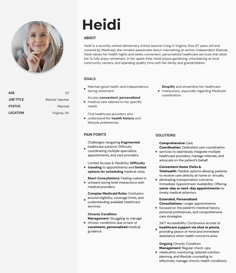
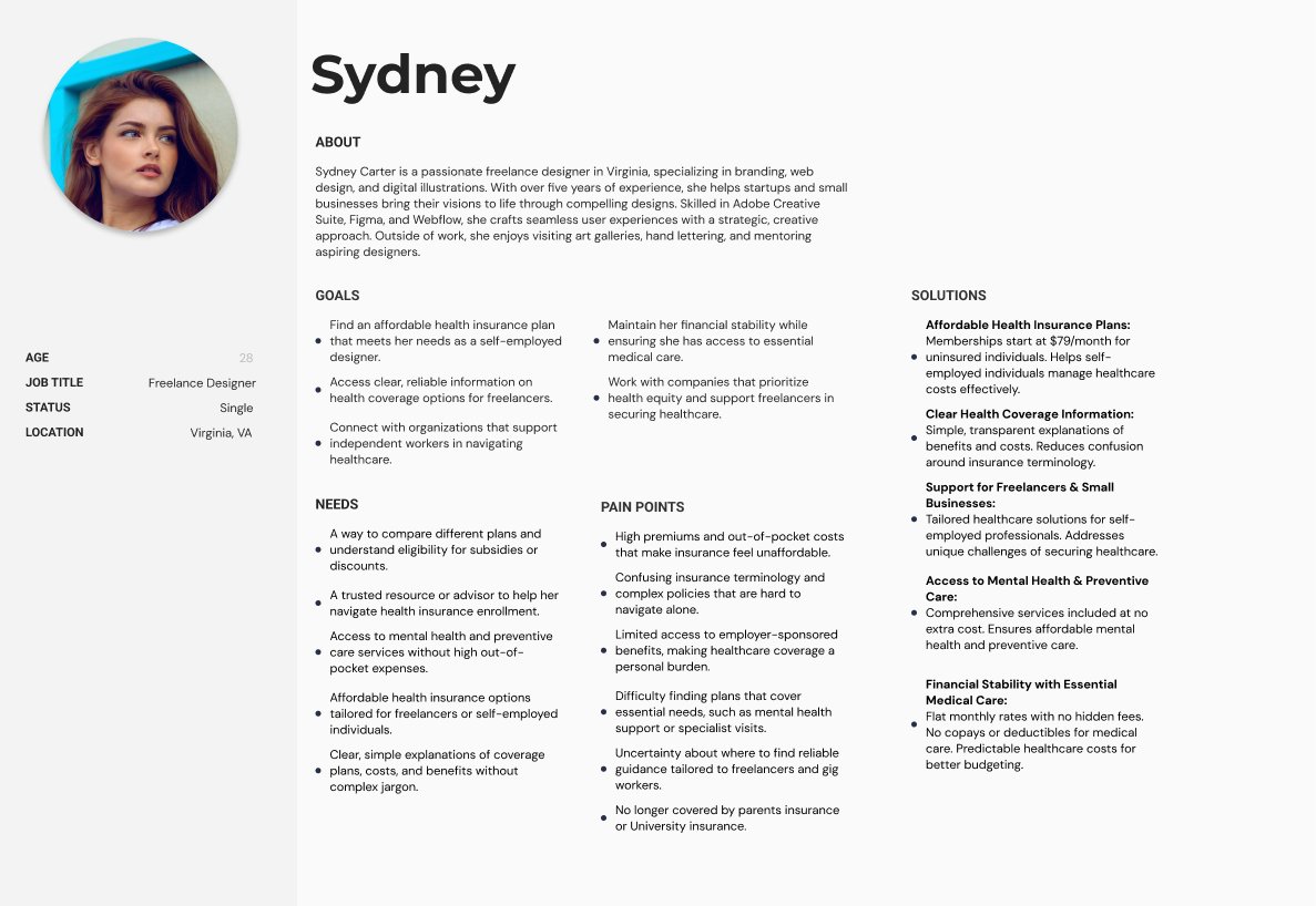
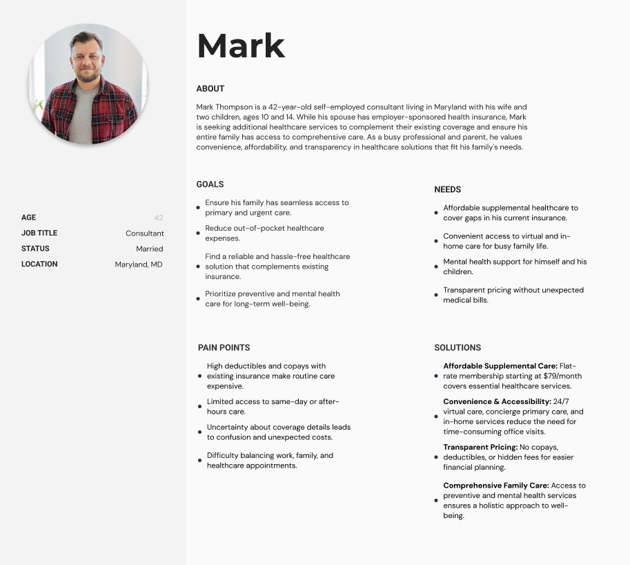
User Personas
Based on our competitor analysis research and a deep understanding of DiscoverU Health’s brand and service offering, we developed four primary personas that represent our core target audiences and their distinct healthcare needs.
Heidi A retired educator on Medicaid who values personalized, coordinated care that simplifies complex systems, supports chronic condition management, and helps her maintain independence and quality of life.
Mark A busy, self-employed father seeking affordable, transparent supplemental care that fills gaps in his family’s existing insurance while offering convenient access to primary, urgent, and mental health services.
Sydney An independent freelancer looking for clear, budget-friendly health coverage tailored to self-employed professionals, with simple guidance and strong mental health and preventive care support.
Alex A small business owner dedicated to offering his low-wage workforce affordable, accessible healthcare benefits that support preventive care, improve employee well-being, and reduce absenteeism. Without the cost or complexity of traditional insurance.
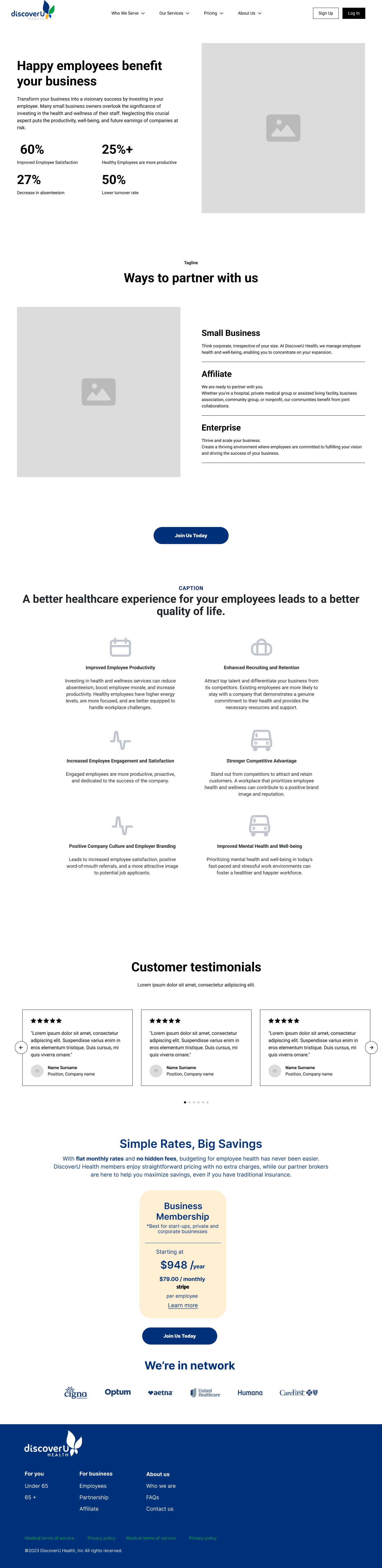
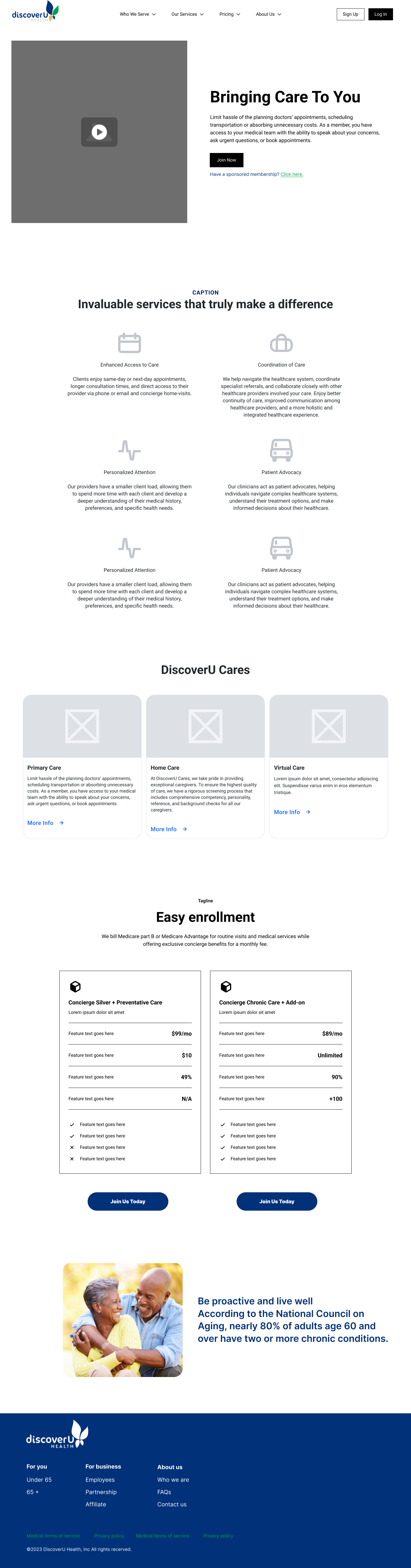
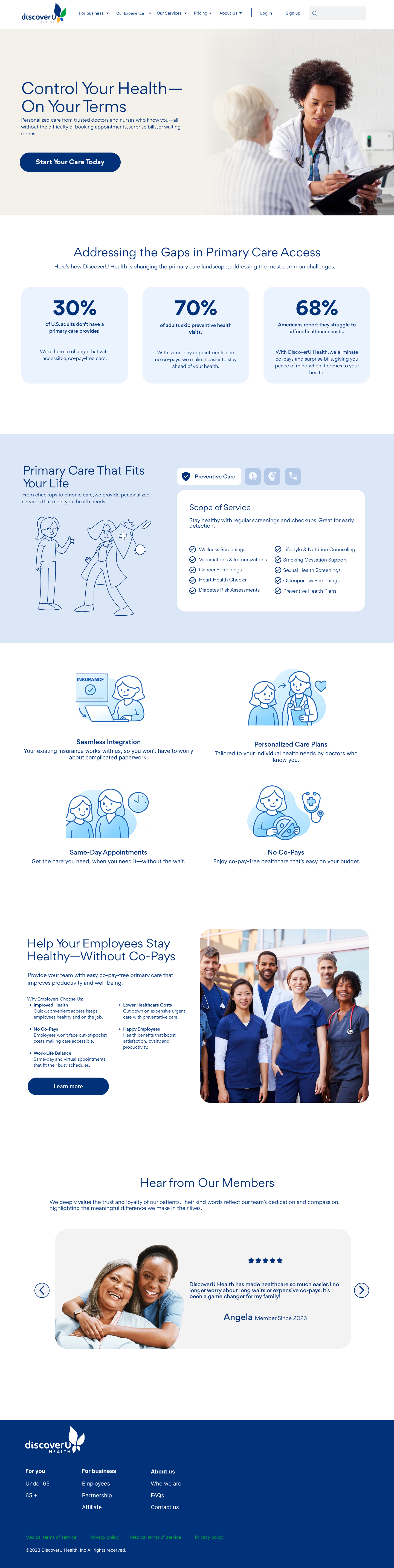
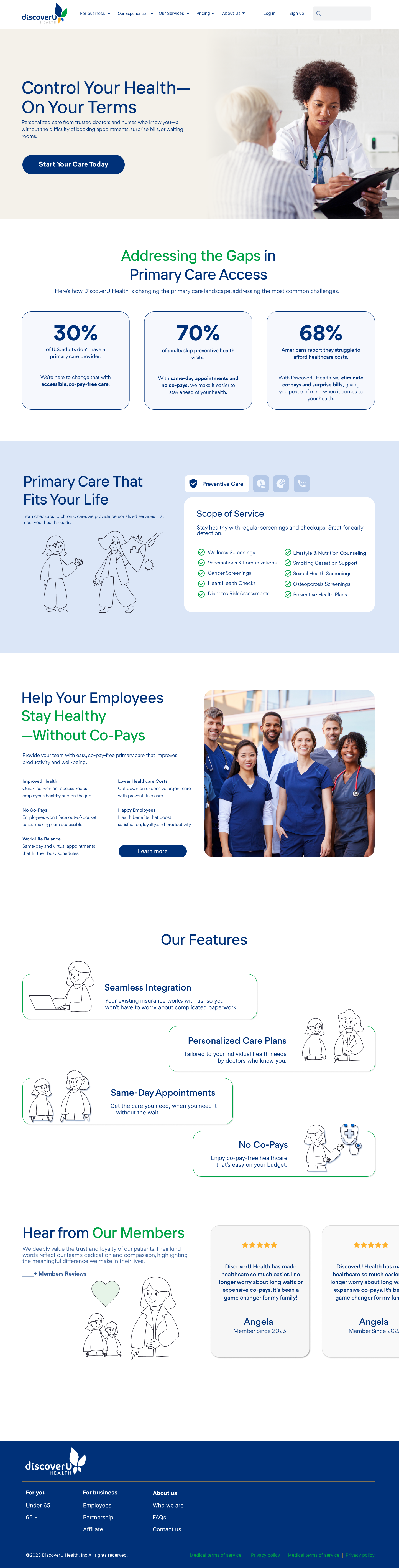
Previous Websites
The legacy websites for DiscoverU Health(Under65) and DiscoverU Cares(Over 65+) are shown on the left; comparatively, the current website is displayed on the right.
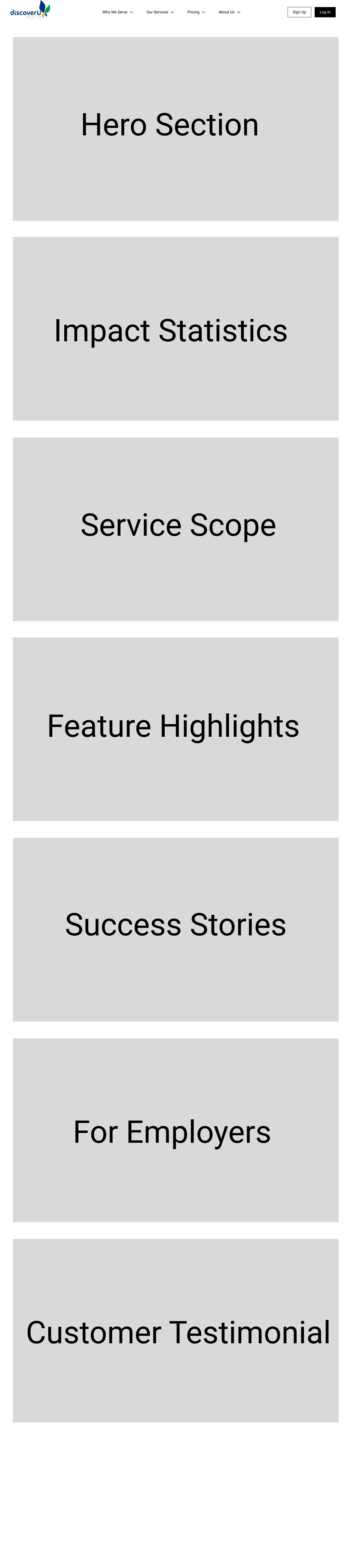
Low - Mid Fidelity Wireframes
Since numerous pages were designed and refined throughout this project, I’ve highlighted a selection of low, mid, and high-fidelity wireframes to demonstrate the design process and how the solution evolved over the course of the design sprint.
Page Sections
Primary Care
Virtual Care
Home Page
Employers
Adults 65+
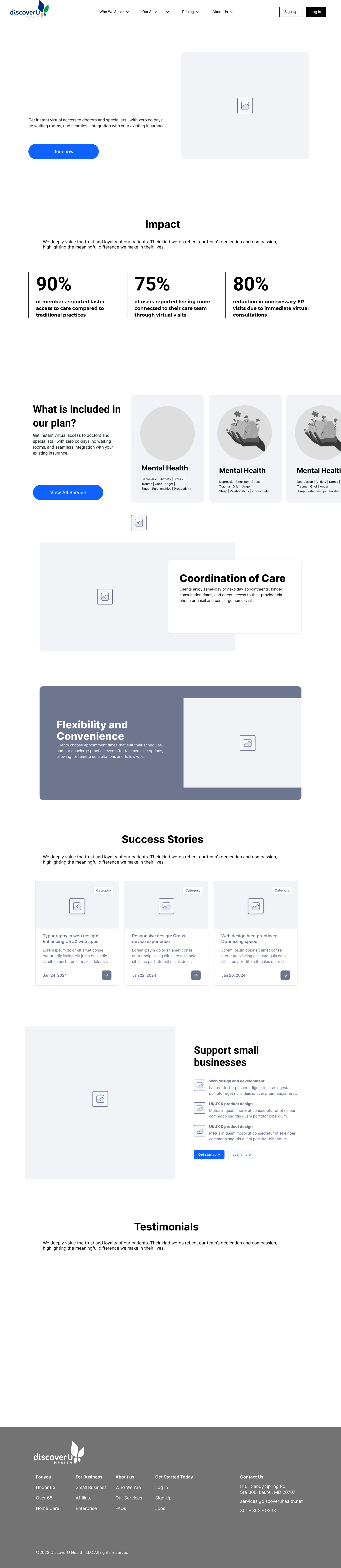
High Fidelity Wireframes
Various iterations
Primary Care V1
Primary Care V2
Home Page
Weight Management
Virtual Care V1
Virtual Care V2
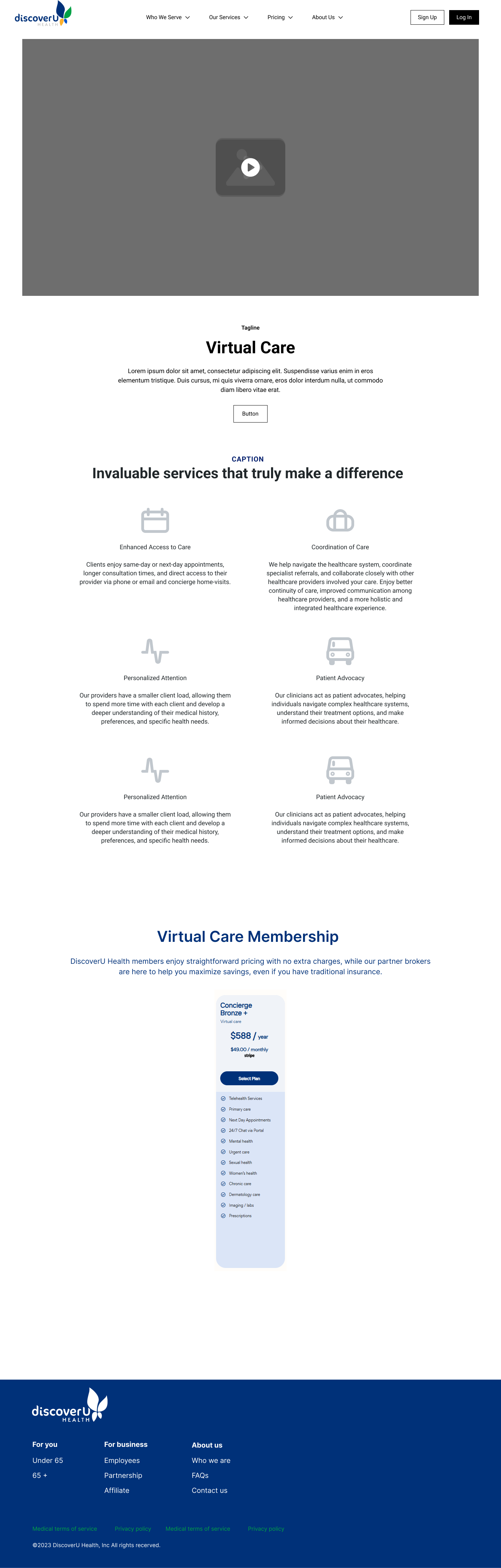
High Fidelity Wireframes
Final Version
Concierge Care
Weight Management
Membership Page
Men’s Health
Women’s Health
Chronic Care
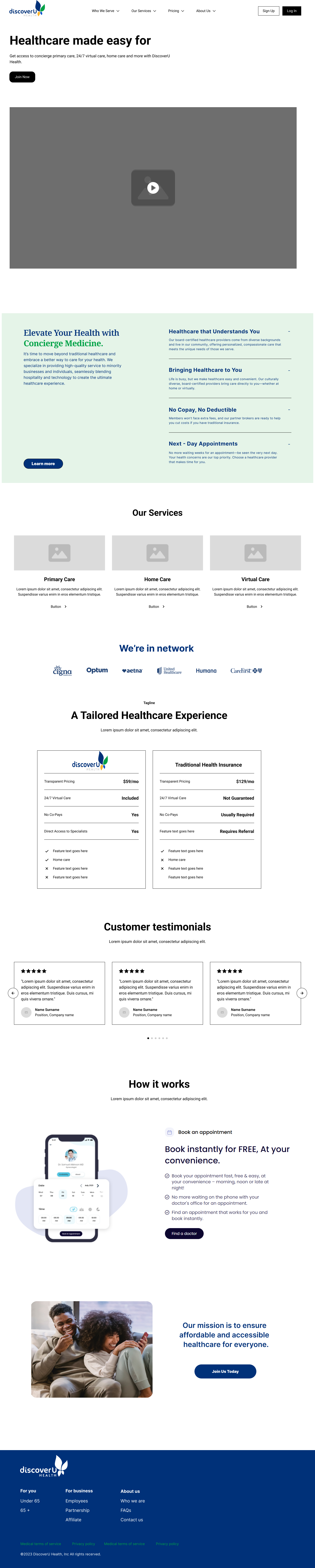
Core Features
A central feature of the website is the Welcome Kit and Membership sign-up portal, which serves as the primary entry point for new members.
Next Steps
Conduct usability testing, including the use of heatmapping software, to identify user behavior patterns and areas for improvement.
Further clarify the value proposition and simplify site navigation.
Strengthen trust signals and create clearer pathways for key audiences (more in – depth testimonials and identity on social media)
Improve accessibility through better color contrast, keyboard navigation, descriptive alt text, and plain-language content.
Ensure the experience is inclusive for older adults and users with disabilities.
Enhance pricing transparency and streamline the conversion flow.
Optimize mobile usability to better support healthcare decision-making.